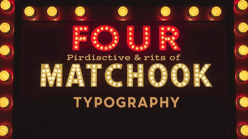
Four Distinctive Eras of Matchbook Typography

The Art Deco Elegance of the 1930s
Mid-Century Modern Minimalism
The Psychedelic Lettering of the 1960s
Retro Boldness of the 1970s
This post breaks down the four distinct eras of matchbook typography to help you identify the age and origin of your collection. Understanding these shifts in letterforms, font weights, and printing techniques allows you to date a piece without relying solely on a printed date. We'll look at the transition from hand-lettered Art Deco styles to the high-gloss, computerized aesthetics of the late 20th century.
What defines the Art Deco era of matchbook design?
The Art Deco era is defined by geometric precision, high-contrast strokes, and hand-drawn lettering that emphasizes verticality and luxury. During the 1920s and 1930s, most matchbook typography wasn't a "font" in the modern sense; it was a custom piece of art created by a graphic designer or sign painter. This is why you'll see much more variation in letter height and weight than you do in later pieces.
Typography from this period often features heavy, sans-serif characters paired with elegant, thin-line flourishes. Think of the Great Gatsby aesthetic—lots of gold, black, and sharp angles. If you're looking at a piece from a high-end hotel or a jazz club, the letters likely feel "architectural."
Common characteristics include:
- Hand-lettering: Slight irregularities in the spacing between letters.
- Geometric shapes: Letters built from circles, triangles, and straight lines.
- High Contrast: Dramatic differences between thick and thin strokes.
- Minimalism: A lack of the "busy" clutter seen in later decades.
Collectors often struggle to date these pieces because the printing technology was more manual. A small mistake in a letter's curve is a sign of a hand-set plate rather than a digital error. If you're having trouble dating a piece from this era, you might want to read about why most collectors misdate their matchbook treasures, as many assume a "vintage look" means it's actually old.
How did Mid-Century Modern typography change the look?
Mid-Century Modern typography moved away from the rigid geometry of Art Deco toward organic shapes, playful scripts, and "atomic" aesthetics. This era (roughly 1945–1965) favored a sense of optimism and movement. You'll see a lot of "bouncy" baselines where the letters don't sit perfectly straight on the line.
The font choices shifted toward the "friendly" and the "futuristic." Think of the way the Mid-century modern movement influenced everything from furniture to waystations. Typography became more rounded. The sharp edges of the 1920s gave way to the soft, sans-serif curves of the 1950s. It's a much more relaxed look—less "grand hotel" and more "neighborhood diner."
During this time, the introduction of better offset lithography meant that colors could be more vibrant and text could be more complex. You'll notice more "script" fonts—the kind that look like elegant handwriting—used for restaurant names. It adds a personal, human touch to the paper. It's a bit more approachable (and way more colorful) than the starker designs of the previous era.
Typical Mid-Century Typography Styles:
- The Script Look: Fluid, cursive-style lettering used for hospitality brands.
- The Atomic Look: Quirky, uneven weights that feel energetic and "space-age."
- The Friendly Sans: Rounded, thick letters that feel approachable and unpretentious.
What does the psychedelic and pop era look like?
The late 1960s and 1970s brought a total rejection of "clean" design. Typography in this era is often loud, distorted, and intentionally difficult to read. This was the era of the "bubble" font and the "psychedelic" swirl. If the text on your matchbook looks like it's melting or vibrating, you're likely looking at a piece from this period.
Colors became much more saturated. We aren't talking about subtle pastels anymore; we're talking about neon oranges, deep purples, and avocado greens. The type itself became a graphic element rather than just a way to convey information. It's common to see letters that are heavily stylized or even illegible at first glance. The goal wasn't just to tell you the name of the bar—it was to set a mood.
This period also saw a massive increase in the use of "bubble" and "groovy" fonts. These fonts have almost no sharp angles. They are thick, heavy, and often have a 3D or shadowed effect to make them pop off the cardboard. It's a stark contrast to the thin, elegant lines of the Art Deco era. It's a visual "shout" rather than a polite suggestion. (And honestly, it's a lot more fun to look at.)
Is modern typography easy to identify?
Modern typography is defined by digital precision, standardized font families, and a return to clean, minimalist aesthetics. Most matchbooks produced from the 1990s onward use standard digital fonts like Helvetica, Arial, or even more specialized branding fonts. The "human" element of hand-lettering is almost entirely gone, replaced by the perfect uniformity of computer-generated type.
The catch? Modern pieces often look "borofied." They lack the character and the tiny imperfections that make vintage pieces so interesting. The lines are perfectly straight, the kerning (the space between letters) is mathematically perfect, and the colors are often more muted or, conversely, extremely high-definition digital prints. There's a certain sterility to it.
When you compare the eras, the evolution of the "look" becomes clear through this table:
| Era | Primary Style | Vibe | Key Feature |
|---|---|---|---|
| Art Deco | Geometric / Hand-drawn | Luxury / Formal | Verticality & High Contrast |
| Mid-Century | Organic / Script | Optimistic / Friendly | Rounded Edges & Bouncy Baselines |
| Psychedelic | Distorted / Bubble | Rebellious / Loud | Melting Text & High Saturation |
| Modern | Digital / Minimalist | Clean / Standardized | Perfect Kerning & Precision |
One thing to watch for is the quality of the print. In older eras, the ink might bleed slightly into the paper fibers, creating a soft edge. In modern pieces, the edge of a letter is razor-sharp. This is a dead giveaway of the printing technology used. If you're looking for rare matchbook designs from lost eras, you're essentially looking for those beautiful, imperfect, hand-set letters that a computer just can't replicate.
The way a font is used tells you more about the culture of the time than the words themselves. A heavy, blocky font screams 1950s industrialism. A swirling, colorful script screams 1970s nightlife. As a collector, learning to read these "visual languages" is what separates the casual observer from the true enthusiast. It turns a simple piece of cardboard into a historical document.