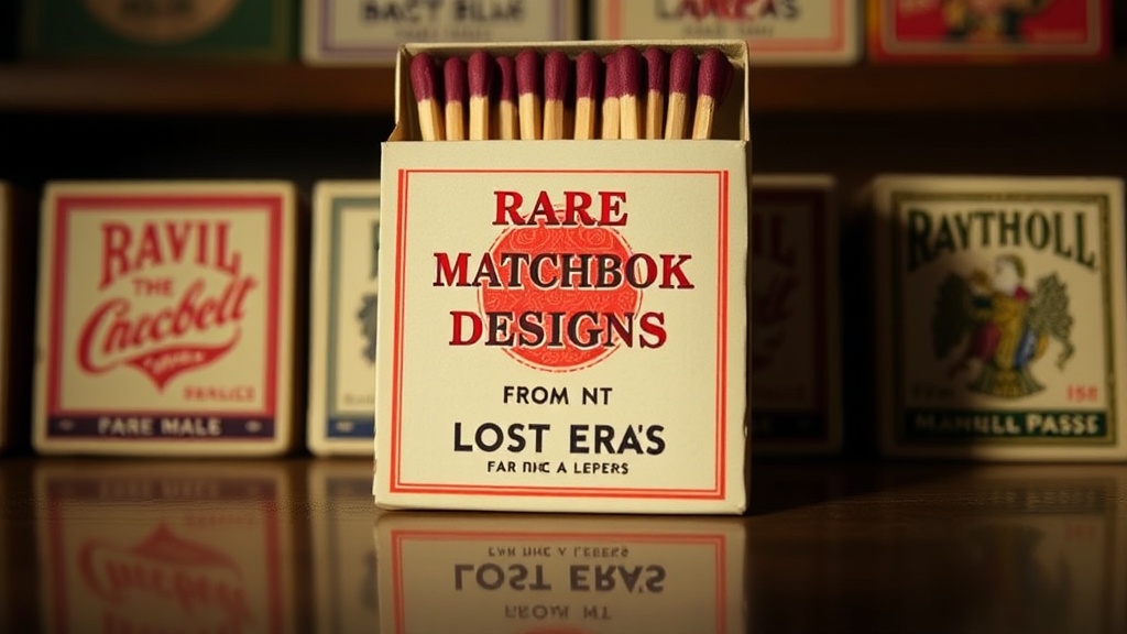
Rare Matchbook Designs from Lost Eras

The Art Deco Era Elegance
Mid-Century Modern Minimalism
Psychedelic 1960s Patterns
A collector in London once spent three years tracking down a single 1950s promotional piece from a defunct jazz club in Soho. He didn't just want any matchbook; he wanted the specific lithography that used a certain shade of cobalt blue. This level of obsession is what separates casual hobbyists from true archivists. We're looking at the high-end of the paper and print world today—specifically, the ephemeral artifacts that survived the transition from the mid-century to the modern age. We're diving into the rare design aesthetics that defined lost eras of hospitality and nightlife.
Matchbooks are more than just fire starters. They are tiny, portable billboards. When you look at a vintage piece, you aren't just looking at a scrap of cardboard; you're looking at a specific moment in graphic design history. From the heavy, textured cardstock of the 1940s to the sleek, minimalist layouts of the 1970s, the evolution of printing technology has left us with a trail of beautiful, fragile evidence.
What Makes a Matchbook Design Rare?
A matchbook design becomes rare when it combines limited production runs, high-quality printing techniques, or a specific historical context that makes it a survivor. Most of these items were meant to be used and thrown away. That's the whole point of an ephemeral object. If a bar used 500 matchbooks a week and they were all tossed in the trash, finding a pristine one today is a win.
There are a few specific factors that drive up the value and rarity in the collecting community:
- Lithography Quality: High-end lithography-printed books often feature richer colors and more intricate detail than standard letterpress versions.
- The "Unstruck" Factor: A matchbook that hasn't been used—meaning the matches are still intact and the striker is clean—is the gold standard.
- Niche Branding: Small, family-owned establishments or local diners often produced much smaller batches than national hotel chains.
- Material Composition: Earlier models often used heavier, more durable cardstock that has survived better than the flimsy versions from the 1980s.
If you are just getting into the hobby, you might want to check out my beginner's guide to collecting to understand the basics of grading and sourcing. It helps to know what you're looking at before you spend big money on a "rare" find.
Which Eras Produced the Best Graphic Designs?
The mid-20th century, specifically the 1940s through the 1960s, produced the most iconic and collectible graphic designs due to the rise of Art Deco and Mid-Century Modernism. This was a time when graphic designers were experimenting with bold typography and hand-drawn illustrations that couldn't be easily replicated by modern digital printers.
Let's look at the three heavy-hitting eras for collectors:
- The Art Deco Era (1930s-1940s): These designs focus on geometric shapes, elegant lines, and high-contrast colors. You'll often see gold foil or metallic inks that have aged beautifully.
- The Mid-Century Modern Boom (1950s-1960s): Think of the "Googie" architecture style. These matchbooks feature bright, poppy colors and whimsical, space-age illustrations. They are often the most "fun" to look at.
- The Psychedelic Era (Late 1960s-1970s): This is where things get weird. The colors get louder, the fonts get trippy, and the printing often moves toward a more experimental, psychedelic aesthetic.
The quality of the paper used in these eras is a major reason why they stand out. The weight of the cardstock provides a tactile sensation that modern, mass-produced items lack. However, weight isn't everything. You also have to care for them. If you're serious about preserving these, you'll need to learn about protecting your striker surfaces to ensure the matches remain usable and the cardboard doesn't warp.
One thing to keep in mind—and I've seen this happen too often—is that "vintage" doesn't always mean "high quality." Some 1970s pieces were printed on incredibly thin, cheap stock that degrades quickly. Always check the edges for fraying before you buy.
How Much Do Rare Matchbooks Cost?
The price of a rare matchbook varies wildly based on the specific brand, the era, and the condition of the item. A common 1980s hotel matchbook might only be worth a few dollars, while a high-end, mid-century promotional piece from a famous jazz club or a luxury hotel can reach hundreds of dollars in a specialized auction.
| Era/Style | Typical Condition | Estimated Value (USD) |
|---|---|---|
| 1940s Art Deco | Excellent/Unused | $50 - $200+ |
| 1950s Mid-Century | Good/Used | $15 - $40 |
| 1970s Psychedelic | Mint/Unused | $30 - $75 |
| Standard 1990s | Any | $1 - $5 |
It's worth noting that "condition" is a subjective term in the collecting world. A "mint" matchbook should have no creases, no water damage, and a perfectly intact striker. If the striker is worn down from use, the value drops significantly. It's a harsh reality of the trade.
A lot of people think the brand name is the only thing that matters. That's not true. A local, one-of-a-kind design from a defunct diner in rural Nebraska can actually be more valuable to a niche collector than a generic, mass-produced brand like Marlboro. It's all about the scarcity of the specific design. If there are only five known examples of a specific print, that's your target.
For more information on how historical printing methods have changed over time, you can look at the history of lithography on Wikipedia. It provides a great technical foundation for understanding why certain designs look the way they do.
I've spent a lot of time looking at the way ink interacts with different types of paper. In the 1950s, the ink often sat on top of the paper, giving it a certain sheen. Today, most printing is absorbed more deeply into the fibers. That's why those older pieces feel so much more substantial in your hand. They have a presence.
Don't be afraid to hunt in the "wrong" places. Sometimes, the best finds aren't in high-end auction houses. They're in the back of dusty antique shops or even at local estate sales. You're looking for that specific aesthetic—that certain something that tells a story of a time when even a small piece of cardboard was treated with design-led intention. It's a small detail, but it's what makes this hobby so rewarding.