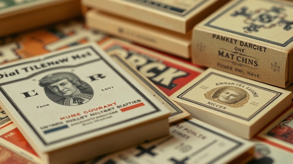
Identifying High-Quality Paper and Print Finishes in Vintage Matchbooks

Imagine you're flipping through a dealer's bin at a local flea market in Portland. You find a matchbook from 1952 that looks stunning—the colors are deep, the texture is heavy, and the printing is crisp. But then you find another one from the same era that looks washed out, thin, and slightly waxy. That difference isn't just luck; it's the result of specific printing-press technologies and paper stock choices that defined the quality of the era. Understanding these tactile differences helps you identify a high-grade specimen from a cheap, mass-produced piece of ephemeral junk.
The physical build of a matchbook—the weight of the cardstock, the way the ink sits on the surface, and the sheen of the finish—tells you a lot about its origin. We aren't just looking at art here; we're looking at the industrial history of print. When you're out hunting, you need to know what to feel for. A high-quality piece should feel substantial, not flimsy or overly glossy in a way that suggests modern coatings.
How do I tell the difference between offset and letterpress printing?
One of the first things you'll notice when you get serious about the paper side of this hobby is the impression of the ink. Letterpress printing, which was common in the earlier parts of the 20th century, often leaves a slight physical indentation in the paper. If you run your thumb over the text (carefully, of course), you might feel a subtle texture where the metal type pressed into the cardstock. This gives the piece a certain weight and depth that modern digital printing just can't replicate.
Offset lithography, on the other hand, is much smoother. It's a process where the image is transferred from a plate to a rubber blanket and then to the paper. This results in a very flat, even surface. While offset became the standard for high-volume production, early examples of high-quality offset can still be breathtaking. You'll notice the colors are incredibly vibrant and the edges of the graphics are sharp, rather than the slightly 'blurry' or 'bleeding' look you might see with cheaper, low-fidelity methods.
What does a high-quality paper stock feel like?
The weight of the paper (often called the 'gsm' or grams per square meter in the modern world) dictates how a matchbook holds its shape. A premium vintage matchbook usually uses a heavy, dense cardstock. It shouldn't feel like a standard business card; it should feel more like a heavy-duty index card or a thin piece of cardboard. This density helps prevent the 'spine' of the matchbook from cracking or bending too easily over time.
When you're evaluating a piece, check for these tactile markers:
- Structural Integrity: Does the matchbook stand upright on its own? A high-quality stock will hold its shape.
- Surface Texture: Is it matte, satin, or glossy? A high-end piece often has a subtle, sophisticated matte finish rather than a cheap, high-gloss shine.
- Edge Crispness: Are the edges of the die-cut clean, or do they look frayed and soft?
If the paper feels too thin or 'papery,' it's likely a lower-tier promotional item. While these are still collectible, they don't carry the same prestige as the heavy-duty, thick-stock versions used by upscale hotels or high-end restaurants. If you want to see more about the history of printing-press evolution, the Library of Congress has incredible archives on how these technologies changed the way information was shared.
Why does the ink finish matter for long-term preservation?
The way ink interacts with the paper is a major factor in how a piece ages. Some vintage matchbooks use a heavy oil-based ink that can sometimes 'bleed' or soak into the fibers, making the colors look a bit muted. Others might use a coating that creates a barrier. This barrier is great for keeping the colors bright, but if the coating is poor, it can lead to peeling or cracking as the paper ages and moves.
You might encounter 'spot UV' or similar finishes where only certain parts of the design are shiny. While more common in modern print, seeing a high-contrast finish on a vintage piece is a sign of a well-made item. It shows that the printer had control over the application. However, be careful—sometimes what looks like a high-end finish is actually just a sign of oil damage or moisture exposure. If the surface feels tacky or sticky, it's a bad sign. That's not a finish; that's a degradation of the paper fibers.
Can I identify a fake by the paper quality?
Yes, absolutely. Modern reproductions often use much thinner, more uniform paper than the original era. A modern digital print on a standard printer will lack the depth and 'soul' of a vintage piece. If you see a 'vintage' matchbook that looks perfectly smooth and lacks any of the characteristic texture of older printing methods, treat it with skepticism. Real vintage paper has a certain character—it's slightly irregular, and it reacts to the environment in a way that modern, treated paper does not.
For those interested in the technical side of paper-making and how it affects artifact longevity, checking out resources like the Library of Congress Preservation page can offer deep dives into how different materials react to time. It's not just about the look; it's about the physical reality of the object in your hands.
When you're out in the field, don't just look with your eyes. Use your hands. Feel the weight, the grain, and the resistance of the cardstock. That's where the real story of the collection lives.